
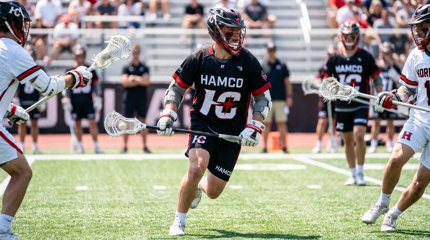
A team logo is a small thing that carries a lot of weight. It goes on the jerseys, the bags, the banners, and the social media, and over time it becomes the visual shorthand for everything the team is. A strong logo makes a team look established and proud, while a weak one quietly undercuts an otherwise sharp look. The good news is that a great logo is not about artistic genius, it is about following a few sound design principles. Whether you are working with a designer or trying it yourself, here is how to design a team logo that actually works.
Keep It Simple
The single most important principle in logo design is simplicity. The most memorable and effective logos in the world are usually strikingly simple, because simple designs are easier to recognize, easier to remember, and easier to reproduce. A logo crammed with detail becomes a muddy blob when shrunk down or viewed from a distance, while a clean, simple mark stays clear and recognizable at any size. When designing, the instinct to add more, more elements, more detail, more text, is usually the wrong one. The discipline to strip a design down to its essentials is what separates a professional looking logo from an amateur one. If in doubt, simplify.
Make Sure It Scales
A team logo has to work at many sizes, from a tiny chest crest on a jersey to a large banner at the field, so it needs to scale well. A design that looks good only at large sizes fails the moment it is shrunk onto a cap or a sleeve. Test any logo design at a small size to make sure it holds up, since fine details that look great large often disappear or turn to mush small. Related to this, a logo should ideally work in a single color as well as full color, since there are always situations, an embroidered version, a one color print, where the full color version is not practical. A logo that scales and simplifies is a logo that works everywhere.
Make It Relevant and Distinctive
A good team logo should say something about the team, connecting to its name, its mascot, its location, or its character. A logo that reflects the team's identity feels meaningful, while a generic one that could belong to anyone does not. At the same time, it needs to be distinctive enough to stand apart from other teams, especially local rivals. The goal is a mark that is unmistakably yours and clearly connected to who you are. This is where a bit of thought about the team's story pays off, since the strongest logos grow out of something real about the team rather than a random image chosen because it looked cool.
Choose Colors Carefully
Color is a core part of a logo, and it should align with the team's overall colors rather than fighting them. A logo generally works best in a limited palette, often the team's two main colors, since too many colors complicate the design and create practical problems when reproducing it. It is also wise to design the logo so it works in one color, since that flexibility matters for embroidery and certain printing methods. Thinking about how the logo will actually appear on gear from the start prevents headaches later. Companies that produce team uniforms, such as Hamco Sports, work with logos across many decoration methods, and a well designed, appropriately colored logo reproduces cleanly across all of them. Color discipline in a logo pays off everywhere the logo appears.
Design With the Uniform in Mind
Since a team logo will spend most of its life on gear, it makes sense to design it with the uniform in mind from the start. Consider how it will look on the chest of a jersey, on a cap, on a sleeve, and against your uniform colors. A logo that looks great in isolation but clashes with the kit or gets lost against the jersey color has not done its job. Resources on visual identity, including those from design focused organizations like AIGA, stress designing a mark for its real world applications rather than just how it looks on a screen. A logo built with its uses in mind is one that will serve the team well across everything it touches.
Conclusion
A great team logo is simple, scalable, relevant, and designed with its real world uses in mind. It does not require artistic brilliance, just the discipline to keep it clean, the foresight to make sure it works at every size and in one color, the thought to connect it to the team's identity, and the practicality to design it for the gear it will live on. Get those right and you create a mark that makes your team look established and proud everywhere it appears, for years to come. A logo is one of the most lasting things a team owns, so it is worth designing well from the start.
 English
Join our community to interact with posts!