In Thailand’s vibrant and competitive coffee market, packaging is far more than a container; it is a silent storyteller, a cultural ambassador, and the first handshake with the consumer. With shelves brimming with options from local hill-tribe roasters to Bangkok-based specialty blends, the imagery chosen for coffee packaging in Thailand is a critical strategic decision. Suitable imagery must navigate a delicate balance between honouring deep-rooted traditions, appealing to modern aesthetics, and communicating quality. Here’s an exploration of the visual lexicon that resonates within the Thai coffee landscape.
1. The Roots: Honouring Origin and Agriculture
Thailand’s coffee-growing heartlands in the North (Chiang Rai, Chiang Mai) and South are points of immense pride. Imagery that directly connects the consumer to this origin is powerfully effective.
Landscapes: Lush, mist-shrouded mountains of Doi Tung, Doi Chang, or Doi Inthanon instantly signal high-altitude Arabica quality. Photographs or illustrations of verdant hillside plantations tell a story of terroir and careful cultivation.
The Harvest: Empathetic shots of local farmers—often from ethnic minority groups like the Akha, Lahu, or Karen—hand-picking ripe coffee cherries humanise the product. This imagery supports community narratives and ethical branding, appealing to a growing consciousness about provenance.
Botanical Illustrations: Detailed, artistic renderings of the coffee plant, cherry, or flower cater to a more premium, educational audience. It speaks to purity, natural processes, and a botanical authenticity that aligns with wellness trends.
2. Spirituality and Symbolism: The Cultural Soul
Thai culture is deeply interwoven with spirituality and symbols of luck, prosperity, and respect.
Buddhist Imagery: Motifs like the lotus flower (purity and enlightenment), the Bodhi leaf, or subtle, respectful depictions of temple silhouettes (like Doi Suthep) can evoke peace, mindfulness, and a connection to the land’s spirit. This must be executed with utmost taste and reverence.
Traditional Thai Art & Patterns: Elements from Lai Thai (traditional Thai patterns) used in temple architecture or silk weaving can be abstracted into elegant borders, backgrounds, or icons. Patterns resembling Kanok (flame-like motifs) symbolise vitality and can add a uniquely Thai luxury feel.
Elephants: A national symbol of strength, loyalty, and royalty, the elephant—especially the dignified Thai elephant—is a potent image. It suggests quality, strength of flavour, and a product worthy of national pride. Stylised, minimalist elephant silhouettes are often more effective than cartoonish versions.
3. Modern Craft and Urban Energy
Thailand’s urban coffee scene, particularly in Bangkok and Chiang Mai, is fiercely innovative and design-savvy.
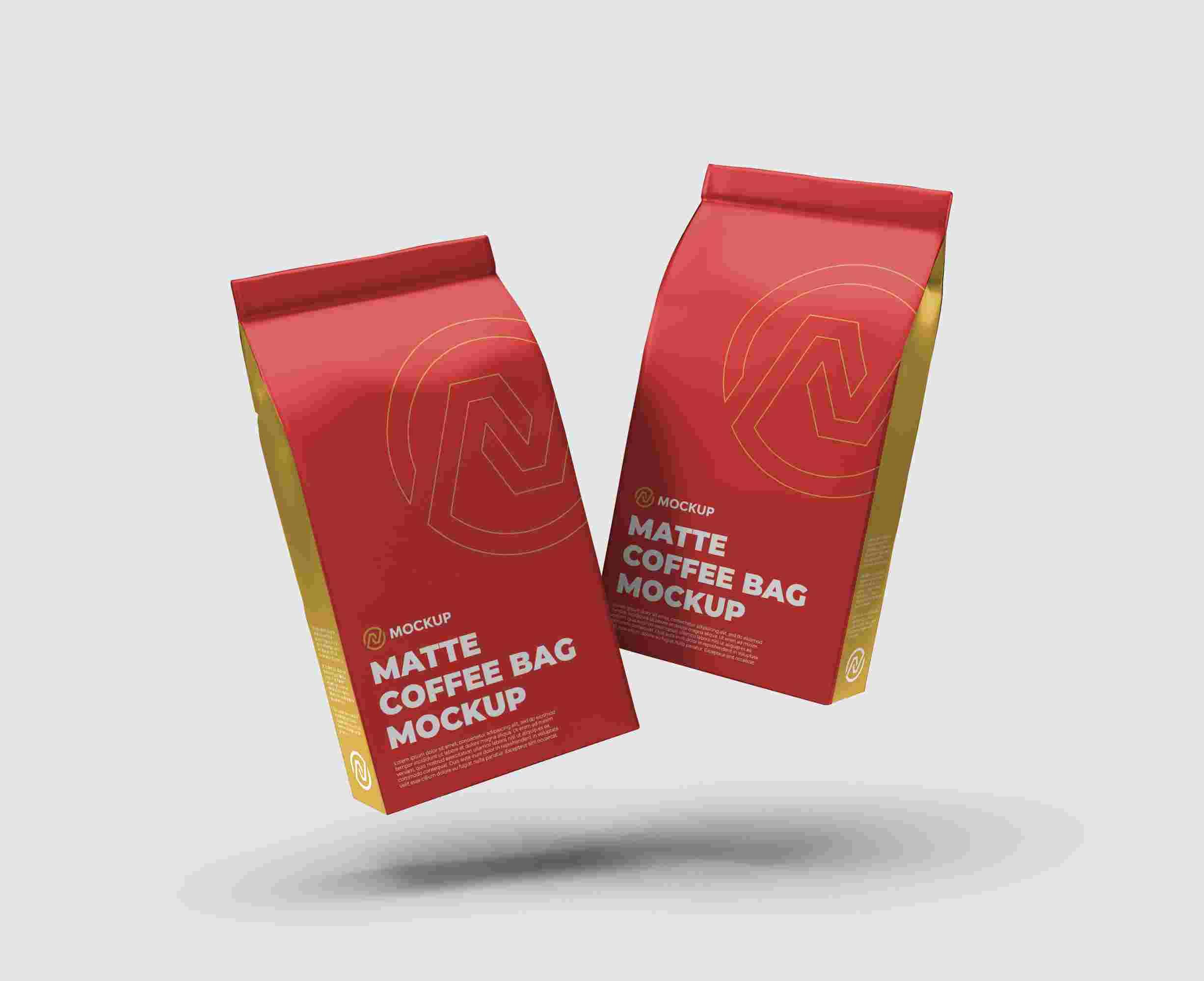
Minimalist & Typographic Designs: Clean layouts, sophisticated colour palettes (earth tones, black, white, muted gold), and a focus on elegant typography in both Thai and English scripts appeal to the cosmopolitan, third-wave coffee drinker. This style communicates direct trade, roast profiles (light, medium, dark), and a focus on the craft of roasting.
Illustrative Narratives: Playful, contemporary illustrations that tell a story—a cyclist navigating Bangkok streets with a coffee, a stylised samlor (tricycle taxi), or abstract representations of the coffee’s flavour notes (e.g., citrus, jasmine, cocoa)—connect with younger, creative demographics.
Localised Modernism: Integrating modern design with a single, iconic local element—like a traditional northern pa kao ma (checked cloth) pattern used minimally, or a sketch of a rong tao (old-style steamboat)—creates a clever, nostalgic yet contemporary feel.
4. Royalty and Premium Quality
For brands whose origins are linked to Royal Projects or those positioned at the ultra-premium end, imagery conveying excellence, development, and national benefit is key.
Insignias and Seals: Official logos of Royal Projects or awards from national coffee competitions act as powerful badges of trust and superior quality.
Regal Colours and Finishes: The use of deep purples, gold foil stamping, and embossed textures can subtly associate the product with excellence and heritage, provided it aligns with brand authenticity.
5. Functionality and Clarity
Amidst all artistry, Thai consumers appreciate clarity.
High-Contrast Visuals: Ensuring key information (coffee type, region, roast date, tasting notes) is legible against the background is crucial.
The “Viewing Window”: A small, tastefully integrated window allowing sight of the whole beans remains a trusted feature, reassuring buyers of bean integrity and roast level.
Ultimately, the most suitable imagery for Thai coffee packaging is that which tells an authentic, cohesive story. Whether it’s the earthy, community-focused narrative of a hill-tribe cooperative or the sleek, craft-oriented tale of a Bangkok micro-roastery, the visuals must align with the brand’s soul. In a market steeped in culture and driven by evolving taste, the right image doesn’t just sell coffee—it invites the drinker into a story, one aromatic cup at a time.
FAQs: Coffee Packaging Imagery in Thailand
1. Are there any cultural symbols we should avoid using on packaging?
Yes, extreme caution is needed. Avoid using images of Buddha or highly revered monks directly on packaging, as this can be seen as disrespectful and commercially exploitative. Similarly, the Thai Royal Family and related crests (like the Garuda) are protected by strict lèse-majesté laws and should never be used without explicit official permission. When in doubt, consult with a local cultural advisor.
2. How important is it to include both Thai and English on the packaging?
It is highly recommended, if not essential. Thai script is crucial for the local market, building trust, and ensuring clarity (e.g., brewing instructions). English (or roman script) signals quality to the domestic premium market, is vital for tourism, and is essential for any export ambitions. The design should integrate both scripts harmoniously, with Thai often taking precedence in size or hierarchy for the domestic market.
3. We’re a modern Bangkok roastery. Does our packaging need to feature farmers or mountains?
Not necessarily. Your imagery should reflect your brand’s identity. For an urban craft roaster, focus on the craft, flavour, and experience. Modern illustrations, clean typography focusing on roast profile and tasting notes (e.g., “bright citrus, dark chocolate”), or abstract graphics representing Bangkok’s energy can be more authentic. You can still honour origin through concise text (“Single-Origin Doi Chang”) without using pastoral imagery.
4. What colours work best in the Thai market?
Colours carry meaning. Earth tones (browns, greens, beiges) effectively communicate natural, organic, and mountainous origins. Gold and deep purple can signify premium and royal-quality associations but should be used tastefully. Vibrant colours can work for fun, youthful brands but avoid garish combinations. Crucially, ensure high contrast between background and text for readability, especially under market lighting.
5. How can we make our packaging stand out while still looking “Thai”?
The key is cultural nuance over cliché. Instead of a generic temple, use a subtle pattern from Lai Thai art. Instead of a literal farmer, use a stylised icon of a coffee cherry picker in a contemporary illustration style. Blend a modern minimalist layout with a single, iconic traditional element, like the texture of woven bamboo or a hint of indigo dye pattern. This approach shows sophistication and a deeper understanding of the culture, making your product distinctive and authentic.
Join our community to interact with posts!